Quantcast
Channel: Brand Identity – The Logo Smith
Viewing all 238 articles
Browse latest View live

@LogoDesignAvenu Rips Off My Tucando Logo

$
0
0

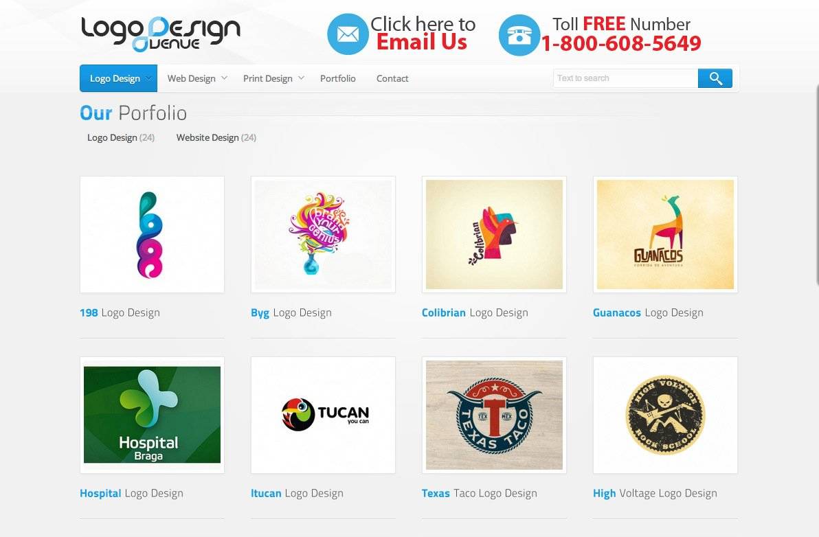
After having my PedalWorks logo ripped off over on Freelancer, I now see that Logo Design Avenue also like my logos and have ripped off my Tucando logo! It’s not identical, but close enough for me to want to investigate further.

Being ‘potetically’ ripped off twice in one week is good going, so thanks to Gert van Duinen for the heads up about this thievery on Twitter.

Name and shame

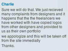
I decided to send them a complaint via their live chat, and got a pretty quick reply—managed to grab a screenshot of the reply before ‘Charlie’ closed the chat and disappeared on me.

Although I appreciate their promised swift response, one can’t guarantee they won’t fall foul again of  ’their’ so called freelancers. Looks like they are a new kid-on-the-block, so probably looking for portfolio fillers whilst they wait for unsuspecting clients to RIP off.

If their own freelancers are not being honest with them, doesn’t bode well for things generally. It will be worth checking their portfolio, on occassion, just incase ‘your’ logo gets ripped.

Not Just Logos

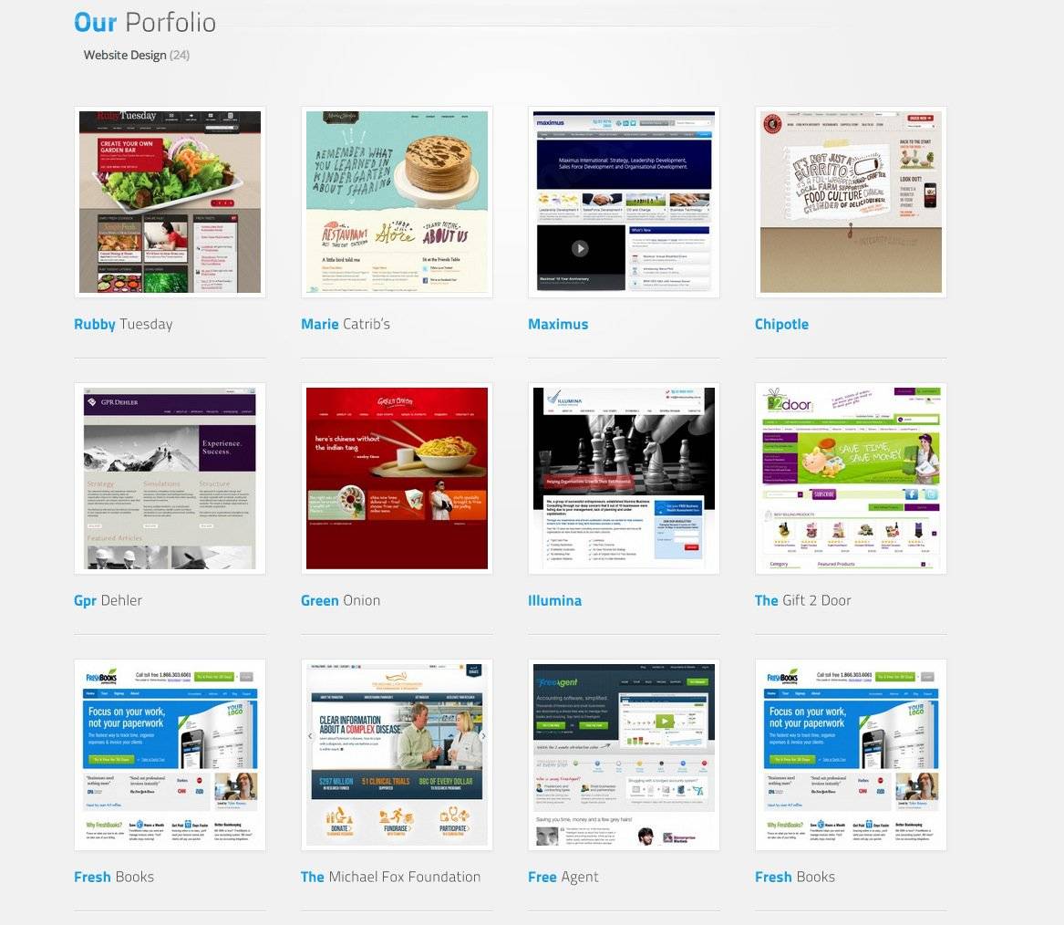
Turns out they just don’t RIP logo designs, but they are quite partial to web site designs as well. Noticed they have taken quite a fancy to Freshbooks’ website design. It’s possible they are using some screenshots of live websites to demonstrate a style of web design that a client can ask for, but even so. Shameful.

Read @LogoDesignAvenu Rips Off My Tucando Logo on imjustcreative - logo & brand identity design portfolio and blog.


The NASA Identity Design Program

$
0
0

Some logos, NASA’s included, should never have been retired. Some logos, NASA’s included, were designed with such skill that they could have gone on and on and on and on.

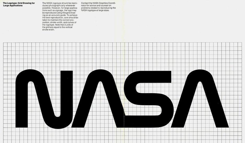
I am still in awe over this version of the NASA logotype, and I always will be.

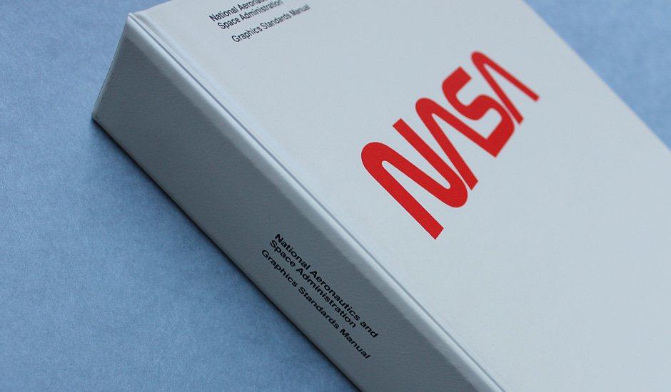
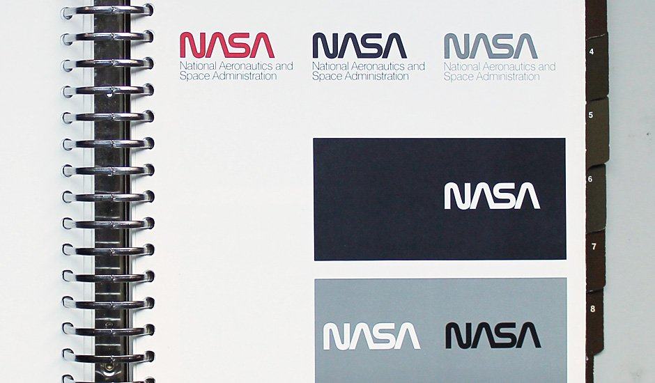
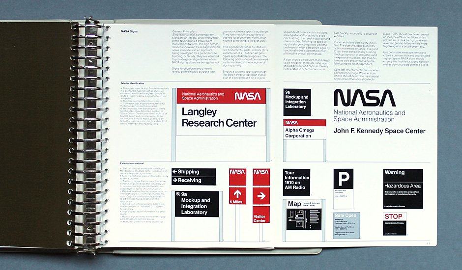
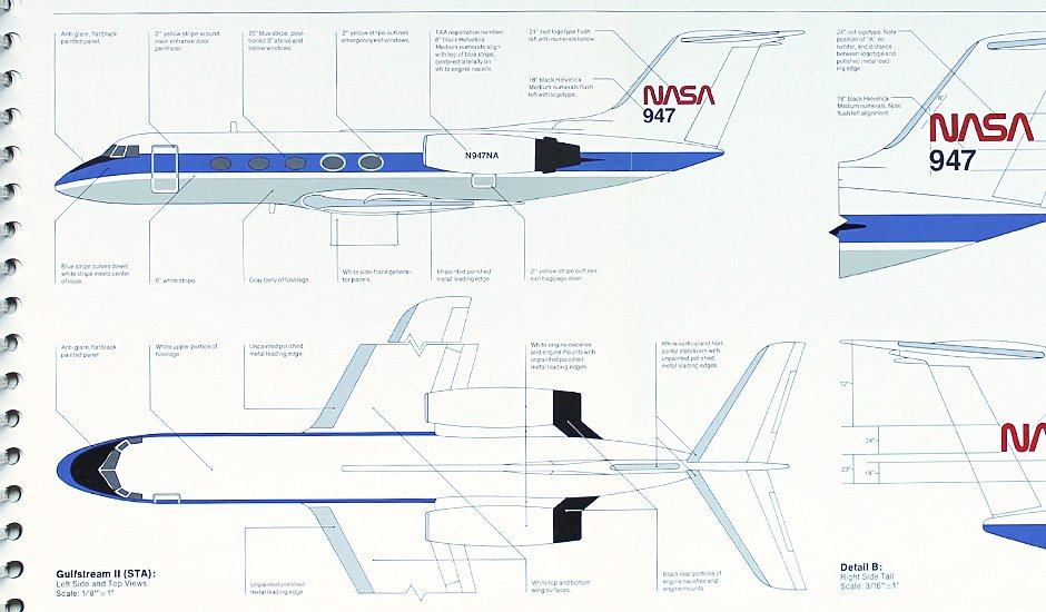
There are some other NASA logo posts elsewhere in my archives, like this post right here: Updated: NASA Brand Identity Guidelines 1976 which is really rather cool in itself, but the purpose of this little post is to kindly draw your gaze over to ThisIsDisplay.org where there is a lovely piece on The NASA Design Program:

The National Aeronautics and Space Administration Design Program is a modernist vision for an optimistic future. The logo (often referred to as the “worm”) evokes qualities of unity, technical precision, scientific capabilities and uniqueness. Reduced to its simplest form; the one width, continuous-stroke letters are as contemporary today as when the logo was first introduced by Richard Danne (Design Director) and Bruce Blackburn (Designer) at Danne & Blackburn, New York, NY) more than 37 years ago. How then, in 1992, after 19 years, did such an emblematic design program for a future-oriented Federal Agency be dropped for it’s previous (now current) Insignia (the “meatball”)? What follows is a heartfelt personal account from Mr. Danne on the obstacles and achievements of one of the century’s most important and widely published design programs.

In case you don’t like reading, and subsequently don’t reach the end of the page, there is a link that will take you to Display’s Flickr Set where there are millions more NASA identity design images.

» Source: Display
» Via: Doobybrain

Read The NASA Identity Design Program on imjustcreative - logo & brand identity design portfolio and blog.

Experimental ID for American Airlines by Anna Koveses

$
0
0

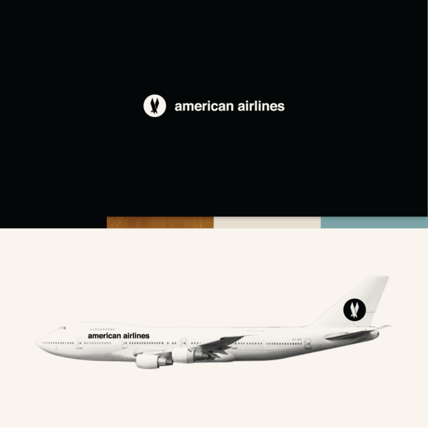
Experimental ID for American Airlines

Experimental ID for American Airlines

Experimental ID for American Airlines

Seeing this reminds me I need to get my finger out and do something equally spectacular for my portfolio. As not real as this American Airlines might be, there is something undeniably easthetically comforting about this Experimental ID for American Airlines by Anna Koveses.

The colour palette, the typography, the presentation of the identity in context to customer touch-points, and the overall project presentation is bewilderingly excellent. Just loving that pair of spectacles; great touch!

Great great job by Anna.

» Source: http://www.behance.net
» Via: Quispsologies

Read Experimental ID for American Airlines by Anna Koveses on imjustcreative - logo & brand identity design portfolio and blog.

In Progress: Logo Sketches for Shark

$
0
0

shark sketches

shark sketches

shark sketches

I don’t often share my sketches: I feel that within the sketches are possible other ideas for new projects, and it can sometimes seem a little trusting to bear your creative soul in such a way as to just asking to be ripped off. Guess I’m not feeling so cynical today. However: all images are Copyright of imjustcreative-Graham Smith 2012.

Currently working on a new logo project called Shark: a swimwear brand focusing on creating performance mens swim trunks for the aqua competitive.

Initially started out trying to shoehorn in a sharks tail as a form of serif on the S (first lot of doodles on first image), but soon realised that there was a possibilty to manipulate the entire S rather than just a portion.

The aim now is to try and stylise the S to have some form/shape that represents a shark, but without being too lifelike/realistic/literal, but also not so abstract as to have no idea what the hell it is.

I have been inspired by Gothic, BlackLetter and calligraphic style fonts as an initial direction for the logomark. The challenge right now is designing it so it doesn’t appear like a seahorse, or too much like a hammerhead shark or other undesirable manifestations of unrelated animals.

The general idea is to fashion the shape so that it looks like the shark is in a tight twist, all ready to fiercely swipe out its tail into your face whilst propelling itself forward.

There is one doodle I do like, which is in the sketch directly above and is next to the feint ‘h’. A little too realistic for this project, but liking the overall form.

Very early days, but I also think we are pretty close to nailing this. My goal is to create a form of this mark that would look utterly awesome as a upper arm tattoo.


Read In Progress: Logo Sketches for Shark on imjustcreative - logo & brand identity design portfolio and blog.

8 Page Logo Specification Book Template for Download

$
0
0

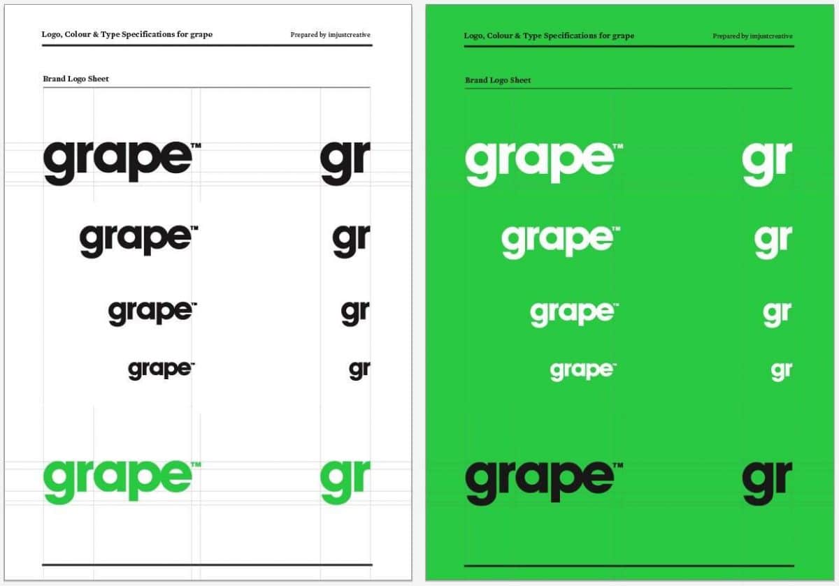
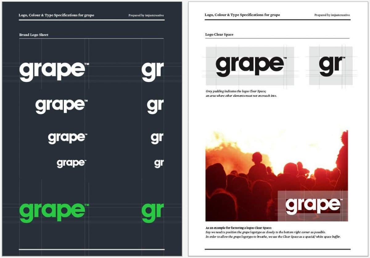
Grape Logo Specification Book

8 Page Logo Specification Book Template for Download

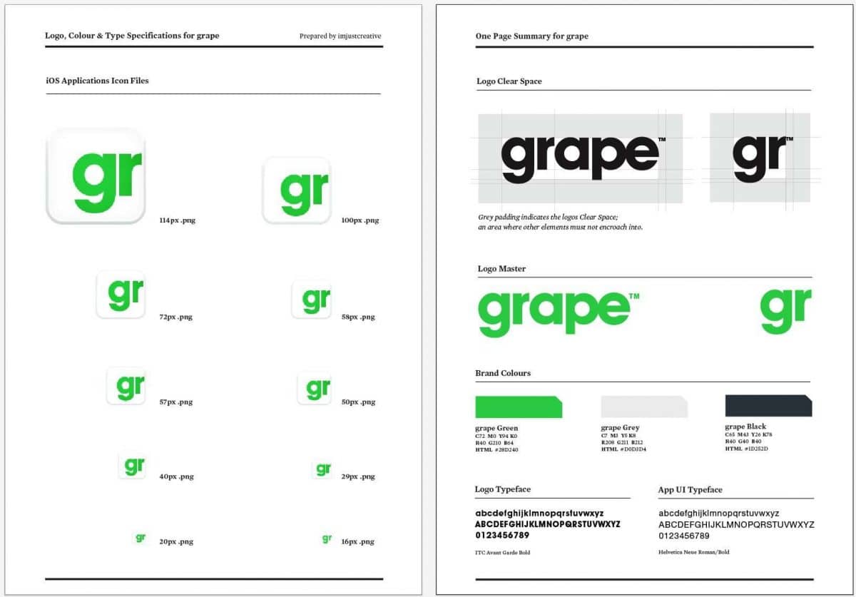
Along with my other logo guidelines and specification templates available to you, I now have added this 8 page logo sheet and style guide as a downloadable template.

The ‘grape’ logo is a current project I am working on, and so these guidelines have been designed specifically for the client. It’s not fully complete as I have yet to add details on the stationery, further info on how the logo can be used etc, but these eight pages provide the main details.

This guideline template is a little different to my previous ones as it incorporates a page of iOS application icons which go hand-in-hand with the project, more info on the typefaces as well as providing a final artwork logo sheet.

I have also summarised the seven main pages of logo, typestyle, colour and icon guidelines into a One Page Summary as a convenient extra for the client.

Please Note

I have removed all instances of the ‘grape’ logo from the template, and replaced the icons with black placeholders. I realise it then looks a little naked, but just used the guidelines I had in place as positional to place your own logo, and then adapt those guides as needed.

It’s more about just being able to provide you with something to get you a head start in you own project. This should all still provide you with a sound base to adapt your own logo sheet and guide from. You can download the template from the following link.

All fonts have been converted to outlines and I have provided both .ai and PDF versions. If you require another format, then please drop me a line in the comments and I’ll see what I can do for you.

Hope you might find it useful.

Download 8 Page Logo Specification Book Template

Read 8 Page Logo Specification Book Template for Download on imjustcreative - logo & brand identity design portfolio and blog.

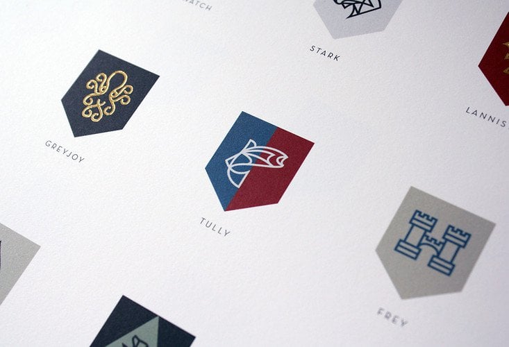
Game Of Thrones Rebranded by Nike Designer Darrin Crescenzi

$
0
0

Been meaning to post this for some time after seeing it in FastCoDesign.

A little hard for me to actually understand specifically what is going on here with these designs as I have never watched Game of Thrones. That aside, the creative work for each of these sigil’s utterly astounds me no end. I just keep ending up keep staring at the whole masterpiece: the offset poster with UV inks and foil stamping!

Read the piece in FastCoDesign as Darrin spills all, and also worth glimpsing the post on UnderConsideration.

» Source: http://darrincrescenzi.com/
» Via: FastCoDesign

Read Game Of Thrones Rebranded by Nike Designer Darrin Crescenzi on imjustcreative - logo & brand identity design portfolio and blog.

Explaining Logo Design Budgets to Clients

$
0
0

The question I’m most asked? “How much will it cost me for you to design me a logo?”, and that’s often bluntly asked in the first line of a one line only email.

Sometimes I do get people calling me up for a chat which ends up them asking me how much I charge for a logo design. Due to the way I work it’s rarely as simple as just giving someone an accurate fixed price, especially if I have little, or no, idea about what I am supposed to be designing a logo for.

The usual scenario that unrolls once I am asked that question, “How much do you charge for a logo design?”, is that I first ask them to take a look and consider filling in my online design brief form that enables the all important brief to be formed as well suggesting they browse my logo design price guide. Although these are guides, they do provide quite a good overall idea of how much it may cost to work with me, and may be the moment they realise I’m somewhat too expensive etc.

Oftentimes I do end up talking to a potential client on the phone whom expresses a clear motivation in wanting to hire the ‘right person’ for their logo design, as well as being aware of the possible costs involved, but they need some ‘help’ getting their head around the prices that they have seen on my price page.

I nearly always end up putting that question of “how much?” back to the client because I feel it’s important that a potential logo design budget is something the client needs to work out for themselves. The way I explain this is as follows.

Analogies

I worked up a few analogies that I feel explain the importance of charging the right amount for a logo design, whilst also explaining the motivation, justification and reasoning behind the ‘why’ as well as the importance of a client understanding exactly what they are supposedly spending all this money on.

We are accustomed to spending money, without thinking about it, on things, like: iPhone apps, coffee and cake, clothes, gadgets and we often do so without regard. Yet the the moment we need to buy something really expensive and important, something that is not as easily “blindly justified”: a need rather than a want, we have to sit down and take stock of a few things which usually means regretting all those app’s we have bought recently, any cool mid price gadgets £250-£500, and other non crucial 1st world desirable item that has mysteriously eaten into our savings at the expense of putting more cash into our pension.

I like to think that my analogies help to provide the client with a real world comparison that allows them to view the idea of a logo design budget as something that is important, valid and worthwhile.

An ‘expense’ that they could be ‘almost’ excited about, not viewing it as a burdening drain on their cashflow much like we might do with: car insurance, car repairs, household utility bills, house repairs and other unexpected yet expensive drains on ones finances.

How it Works

Once I am asked the question of how much a logo design will cost, and I have bounced it right back to them, I will then follow up with a few nuggets of wisdom. It’s all about providing the context, some much needed real world comparisons that makes the digestion of having to work out a budget a little easier to make, as well as justify.

I’ll typically start by explaining: “As with many things in life we often have to sit down and work out how much we want to spend, or can spend, or have to spend on something really important.”

Then I’ll hit them with my analogies. 

Analogy One: You are saving up for a much need holiday, one that will definately break the bank, one that is needed due to your constant hard work over the years. You’ll have a pretty good idea about: how much is too much, and how much is not enough as you go through all your other expenses and outgoings.

This holiday is really important to you, so you make a determined effort to try and afford the best you can, whilst not totally breaking the bank. You’ll quickly have a figure in your head that may need some justification on your behalf, but ultimately you know that it will be worth the investment and drain on your bank balance.

That budget, although definitely steep, is still one you are ‘mostly’ happy and excited about spending given the positive effects it will have on you, or just worry about the financial fall-out when you get back. The holiday blues is no real mystery in most cases.

Analogy Two: Your car of 7 years, that has served you well, finally gets to a point where it’s no longer financially viable to fix all those MOT failures, even though it may still have years left in her could you indefinitely throw money at her.

So the time comes where you have to sit down and think about a new car budget. It’s going to be steep, but you’ll instinctively have a good idea about how far you can stretch yourself with this expensive, yet perfectly justifiable replacement.

Assuming you don’t go crazy stupid on some loan, or other form of credit, you’ll likely buy yourself a car that, whilst hurting your bank account, will provide you with many more years of happy motoring.

A car is typically expensive, yet it still creates that passion and excitement that can help numb that can financial sting.

Analogy Three: Your one bedroom studio loft has served you well over the years, but now you have gotten your girlfriend pregnant you’ll need to expand your living quarters considerably!

As with Analogy One & Two, once you have crunched all the numbers, added your joint salaries, minused the outgoing and baby orientated expenses, you’ll come to budget that will, hopefully, provide you with an adequately sized family house for 3+.

Clearly, buying a house, is no where near the same league as a holiday or buying a car, but the overall emotions are similar in that you are looking to spend the most you will ever spend, yet still be excited/nervous about doing so.

Investment vs Burdensome Cost

I chose these analogies because they demonstrate that not all things we choose, or need, to spend our money on will be easy decisions to make. We do so because we ultimately know that the longer term advantages are clear, and this provides the much needed sense of justification and rationalisation that can otherwise drown us in guilt, cause significant doubt, if we have not done an adequate job of analysing all the pro’s and con’s.

A logo and identity design, at least for many clients that I work with, could well be for some new business/product/service in the pipeline. This client has clearly had to make a number of important strategic decisions to even get this far, not to mention the personal and emotional cost that starting a new business can have on you.

They’ll likely be throwing every single ounce of personal energy and motivation, all their collective focus, energy, faith, eggs into one basket, into this ‘thing’, that is ultimately designed to earn themselves an income.

An income provides us with the opportunity to buy that much needed holiday, that new car or family home. A new logo and identity design is something that deserves to be regarded as an investment into the success of your future, rather than a drain on your wallet.

Yet, and very unfortunately, the logo and identity is often the last thing to be considered. This is not always a massive practical problem for a designer, but it invariably ends up being a financial problem for the client due to dwindling financial resources. Then it comes down to finding a logo designer who’s logo design prices meet with the clients expectations, and this is when the fun can start.

Sitting down and thinking about how important and valuable a new logo and/or brand identity will be to you is not so dissimilar to the analogies above, and in many cases deserves, maybe, more priority than: a 2nd car, or that 3rd holiday this year to Aspen.

I really do find that explaining that a logo design budget being viewed as being a worthwhile investment, rather than a burdensome cost, can to some clients, make the difference to how they approach the sticky issue of: how much to spend on a logo design.

As a designer, it’s not just about having to sell yourself, you also need to be able to sell the end result, the promise and excitement of a logo along with the cost involved to someone who will placing a heck of a lot of trust in you.

A car they can see, a holiday they can imagine, a house they can also see, but a logo design? They only have your portfolio which is of things past. Just something to keep in mind.


Read Explaining Logo Design Budgets to Clients on imjustcreative - logo & brand identity design portfolio and blog.
A Logo Design Project Nearly Wrapped-up

$
0
0

Been a while since I have been able to post anything of note on my main website blog due to being incredibly busy with some hefty client logo projects over the last few months.

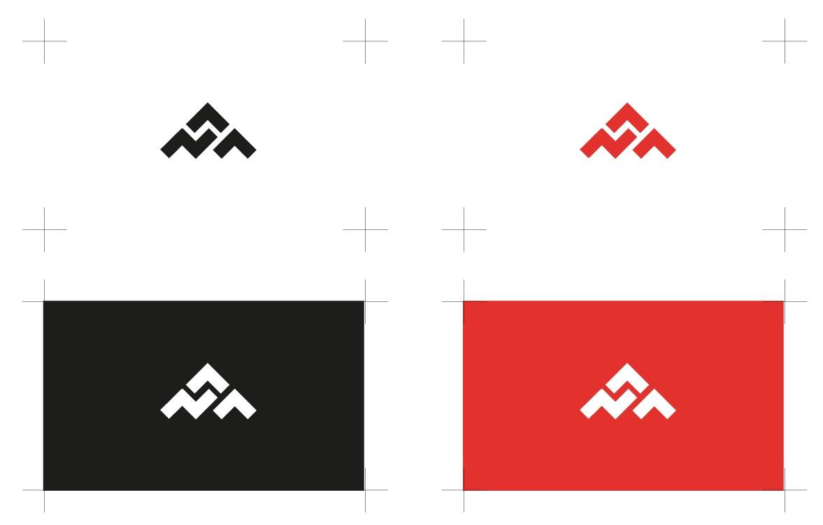
One of these logo design projects is for NAA: Network Architect Associates, which is almost complete. We are just finalising smaller details like: type size, spacing, proportions and brand colours, but the actual logo mark design itself is complete (below).

Yes indeed, the logo mark is a representation of the companies initials forming a pretty solid, and identifiable brand mark in it’s own right. This design isn’t meant to be a straightforward typographic mark, but more of a semi abstract, highly stylised representation of the initials. It doesn’t particularly matter if people don’t see the NAA initially, or even at all, but for those that do it should end up being a memorably mark.

I choose this direction because the full company name is somewhat long, and the client had stated early on that the logo design ought to focus on the initials in preference to the whole three word brand.

For those of you looking to find meaning in the logo mark design, there are a few nice ones:

• I like the appearance of this pyramid, a period where all all the amazing architectural developments were made brick by brick. That a pyramid is enduring, captures our imagination, gives impression of complexity made to look ‘simple’, that we have interlocking pieces that build the NAA brand from the ground-up all whilst showing a upwards and onwards positivity. Building, designing and forming.

• My client did serve in the USAF, and he did mention that he wanted his brand to, To capture the “energy” of our group, I use the military special forces as an analogy. I’d say my team is like the SAS of networking–highly specialized, talented, fast, young, and aggressive.” Early on in the logo designs development it seemed to take on the shape of a stealthy B2 Bomber which forms a bit of a personal bond to the brand for the client.

• This is a company that wants to be seen as relatively aggressive in a ‘getting things done’ way,

• Conveniently there are 3 partners in the company which are represented by each part of the logo marks structure.

So there we have it for now. A quick overview of my latest logo design project with a full logo developmental process post to come at some undetermined time in the future.

Read A Logo Design Project Nearly Wrapped-up on imjustcreative - logo & brand identity design portfolio and blog.

Niice: A [Logo] Design Search Engine With Taste

$
0
0

Screen Shot 2013-04-22 at 12.12.51 Screen Shot 2013-04-22 at 12.12.34

As designers we certainly have a healthy supply of places to draw logo design inspiration from, but it’s always intesting to see new takes on web site inspiration format.

Niice simply collects logo designs and other graphic design imagery from: Dribbble, Behance and Designspiration and free flows them into a  flexible grid for instant consumption.

Key in your search tag criteria and boom…

» Source: http://www.niice.co/

Read Niice: A [Logo] Design Search Engine With Taste on imjustcreative - logo & brand identity design portfolio and blog.
New York City Transit Authority Graphics Standards Manual by Massimo Vignelli

$
0
0

Screen Shot 2013-04-25 at 14.04.13

New York City Transit Authority Graphics Standards Manual

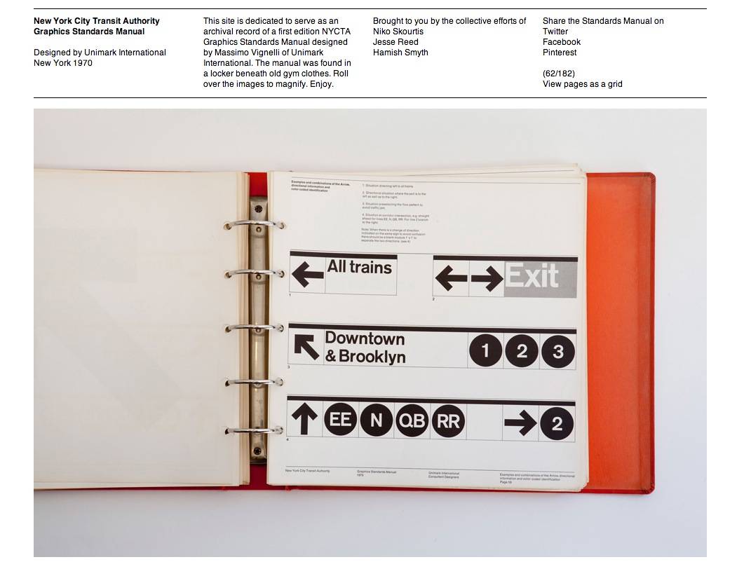
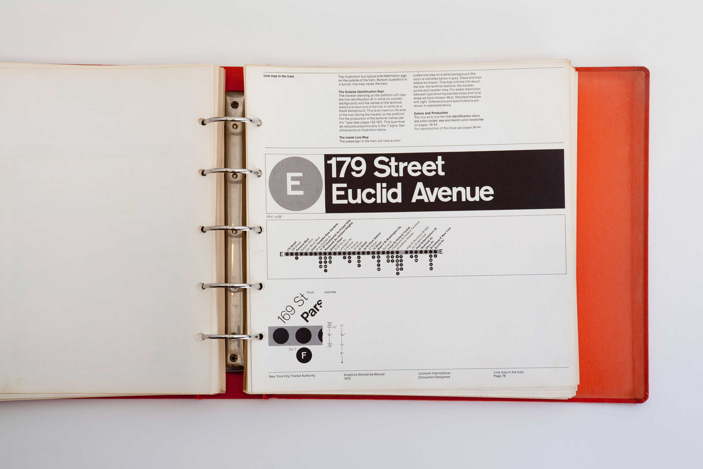
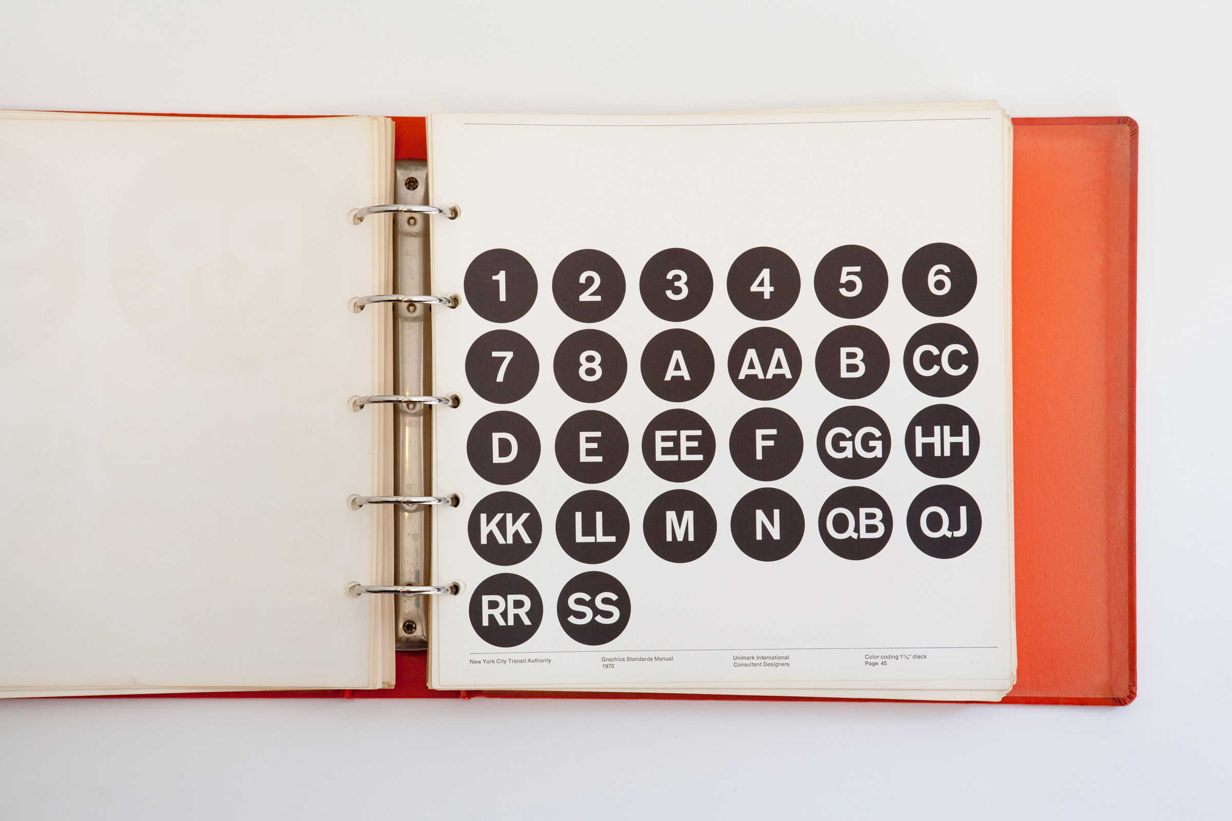
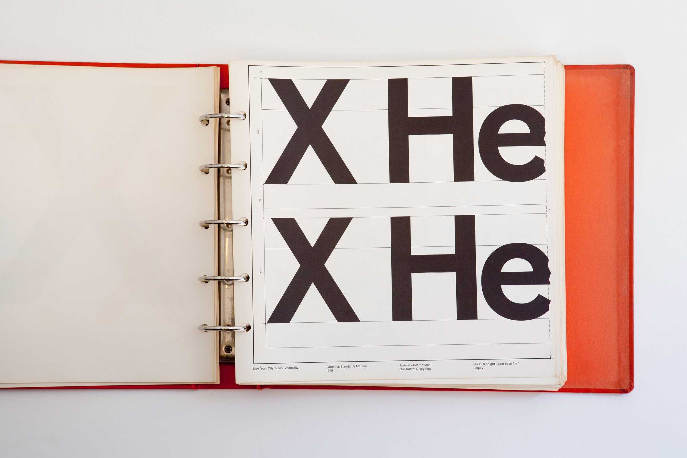
There are a few real world establishments that can claim to have the endearing longevity that the brand identity for the New York City Transit Authority has had and continues to experience. Designed by Massimo Vignelli of Unimark International, in New York in 1970, the New York City Transit Authority’s brand identity has achieved cult status amongst the creative community.

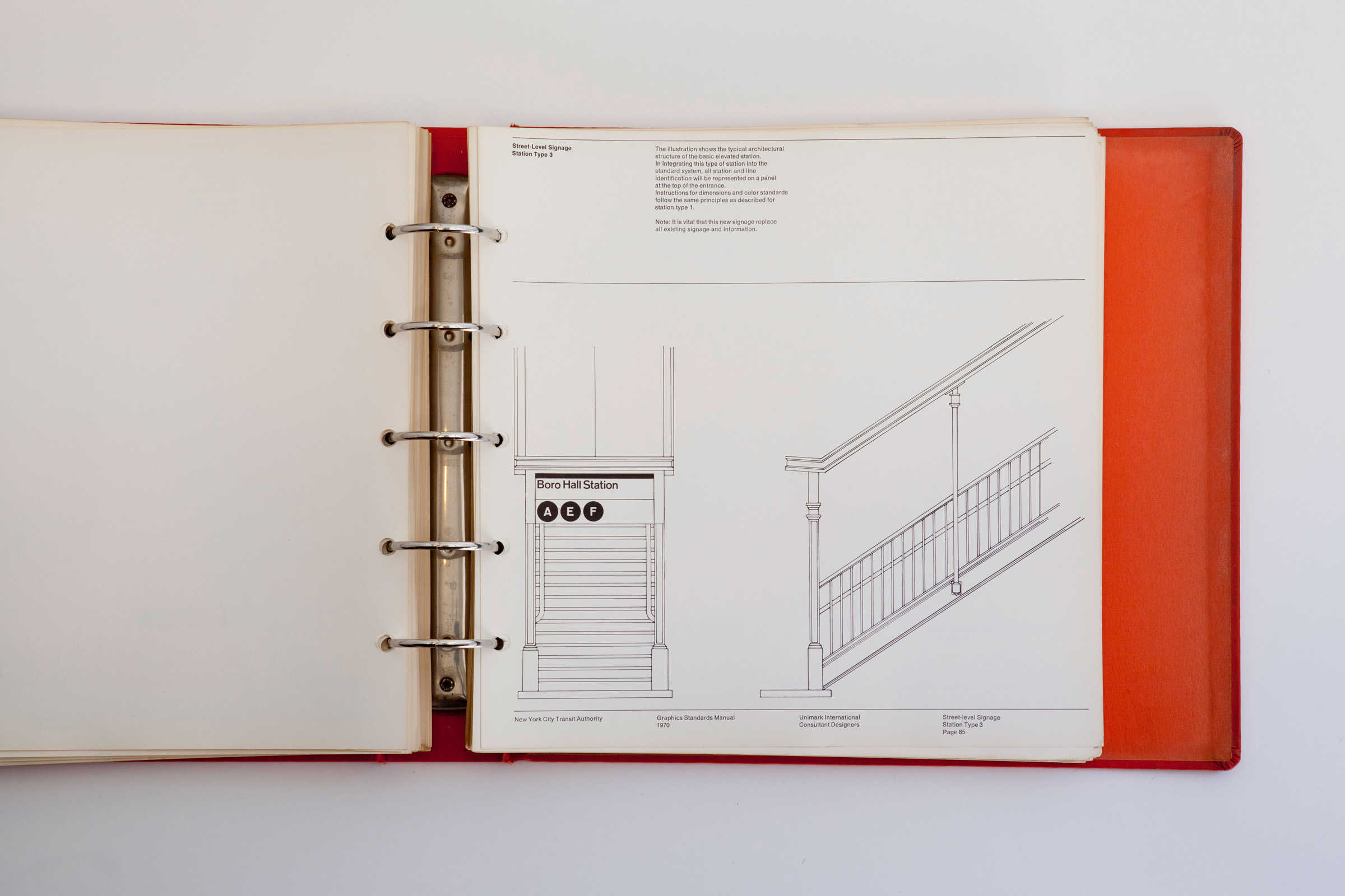
Niko Skourtis, Jesse Reed and Hamish Smyth have collectively created this archival record of the New York City Transit Authority Graphics Standards Manual by Massimo Vignelli. This site is dedicated to serve as an archival record of a first edition NYCTA Graphics Standards Manual designed by Massimo Vignelli of Unimark International. The manual was found in a locker beneath old gym clothes. Roll over the images to magnify. Enjoy.

The http://thestandardsmanual.com micro-site is dedicated to the graphics standards manual of the New York City Transit Authority, and has 182 photographs showing each page of the binded manual. Stunning.

» Source: New York City Transit Authority Graphics Standards Manual

» Via: BrandNew

New York City Transit Graphics Manual 5

New York City Transit Graphics Manual 4

New York City Transit Graphics Manual 3

New York City Transit Graphics Manual 2

New York City Transit Graphics Manual

New York City Transit Graphics Manual

Read New York City Transit Authority Graphics Standards Manual by Massimo Vignelli on imjustcreative - logo & brand identity design portfolio and blog.

The Curse of Literal in Logo Design [AQFG]

$
0
0

gonorrhea

One of the hurdles I find with some projects is a clients belief that the logo should ‘literally’ convey all and every possible meaning and association that they can find. If a logo design is packaged with such literal meanings, and visual clues, then how could anyone misinterpret the logo, or be in any doubt what the logo is representing?

The main problem with loading a logo design with literal symbols is that we don’t really end up with a logo design, but more a busy, and oftentimes, cliche icon and/or mess. I’m not just talking about a client wanting a leaf in the logo because they sell plants, or a car salesmen who wants a car in the logo, I’m talking more broadly where a client may not be aware that a logo isn’t really about trying to make their whole business philosophy somehow visually apparent in the logo design.

To them, and I don’t mean to be patronising, this is a relatively common sense assumption, and this is why we often see such overly obvious logo and shop signs in local towns, and yes, even with larger more global prominent brands.

The curse of the literal cliche loaded logo can be found everywhere.

On one hand it sort of makes sense that if you have a logo that it should try it’s best to convey exactly what the business is about, and I can quite understand how a client may want this approach. Often thought that’s actually not the goal of a logo or identity designer, it’s more about finding the deeper meanings, drive and inner workings of a particular company or brand.

Mafia Humor 2

As logo and brand identity designers we are not particularly looking to create an obvious icon or symbol that is loaded with literal visual clues and meanings. Examples of such are more aligned with road sings, icons and symbols for toilets, disabilities, parking and other public facing areas where the icon has to convey, in the cleanest and simplest way possible, a literal meaning of what to expect.

Logo design as a whole doesn’t really fall into this area, although some logo designs do end up actually being quite literal, but this would be all part of the plan from the outset. The difference is that some brands may benefit from this approach, but others not, but if they do then there is generally a good reason for it.

Consider that many companies have logo designs that when viewed complete alone, don’t actually appear to mean an awful lot. Yet when you take time to look into the company, take the rest of the brand identity into consideration, the logo is likely to make far more sense as a complete package.

It’s not always neccessary to design a logo that when viewed alone makes much sense, but it is important to still try and embody some of the companies soul, essence, personality through the choice of design, colours and typography.

I try and explain to clients who are expecting to see a logo design loaded with literal and easy to understand visual clues, “to try and view your logo as a graphical short hand, or unique avatar for the brand name/business, where the logo styling: abstract, monogram, initials, crest, word mark etc, helps set the initial tone, along then with a tag-line, USP (unique selling point), philosophy, descriptions, elevator pitch, and the other parts of the visual identity will all come together to breathe life into the brand.” If a client doesn’t have a USP, doesn’t know really what they are doing or how to sell the idea convincingly to someone in a few minutes, then it’s hardly fair to expect a logo designer to be able to fill the gap—and why would you take on such a project in the first place?

It’s important not to allow a client to get carried away with believing the logo should, on first-glance, tell who ever it looking at it everything there is to know about the company. This might seem obvious, but I get many completed project briefs where the client has indicated that ‘this, that, this and this plus that and some of this’ must all be conveyed in the logo design.

You, as their logo designer, need to set expectations over what the logo needs achieve as soon as possible. We are generally not designing a road sign icon that implicitly conveys what a company does. Again, that’s not to say that in come cases a logo design might not benefit from that approach. If that is an approach that could work then it’s because you have looked at the other options for this client in particular, and because of what they do it may be really important that a logo design is as clear as possible.

What I’m trying to advise is that you don’t allow yourself to get carried away by saying, “yes yes yes”, to whatever the client asks of you because you want to keep them happy. Remember you are the expert, and the client will be relying on you, whether they know it or not, to steer them the right way, even if they are reluctant to listen at first.

The skill is understanding the complete big picture about what is appropriate for each client (not the client per-sai, but the business/product you are designing for), and then forming a design direction that can, in the cleanest way possible infer/hint/suggest at some of the more important aspects of their brand, or personality, whilst creating a logo mark that is appropriate for their needs, and for the intended audience.

If you are going to go literal in your logo then then ensure it’s because you feel it’s the right direction for the client and their brand needs, and not because you don’t have the balls to say NO! :)

Graham Smith

Ask Graham a Question on Logo & Brand Identity

If you have a question or issue that you need a hand with then please take a look at this post: http://imjustcreative.com/ask-graham-a-question-on-logo-brand-identity and feel free to whip me a line.

I’ll try my best to address it in a unique blog post so that you and others can hopefully get some use from it.

Read The Curse of Literal in Logo Design [AQFG] on imjustcreative - logo & brand identity design portfolio and blog.
Beano Brand Guidelines Designed by Wayne Hemingway

$
0
0

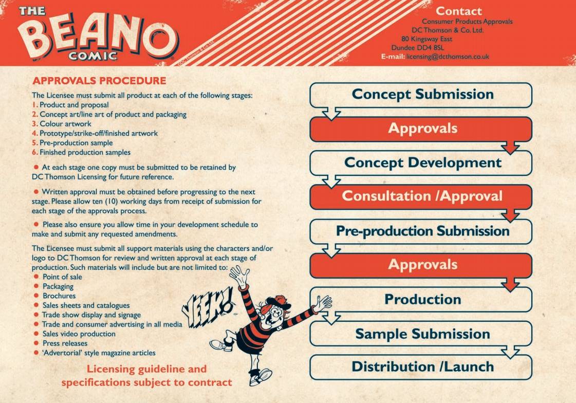
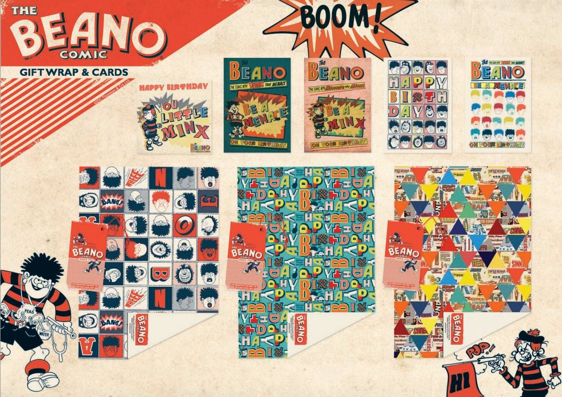
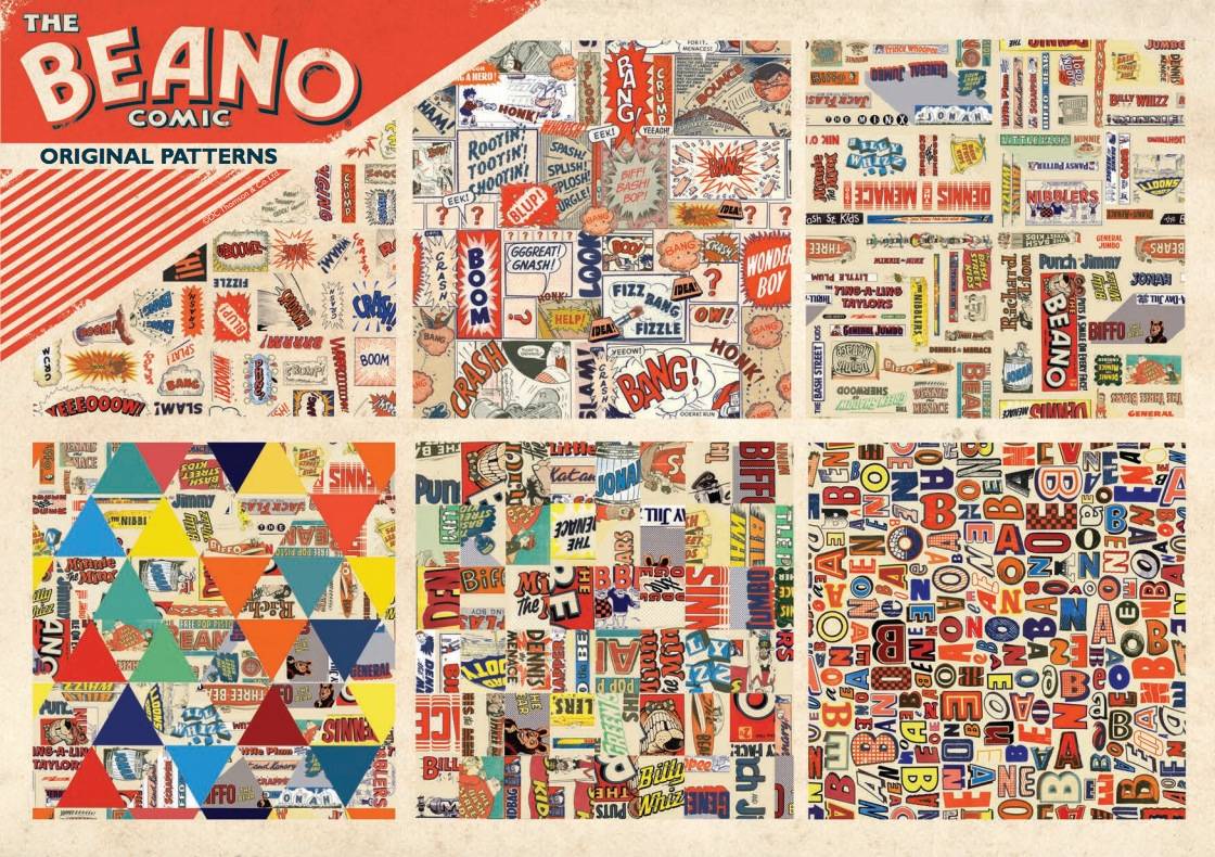
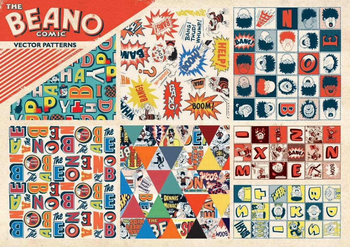
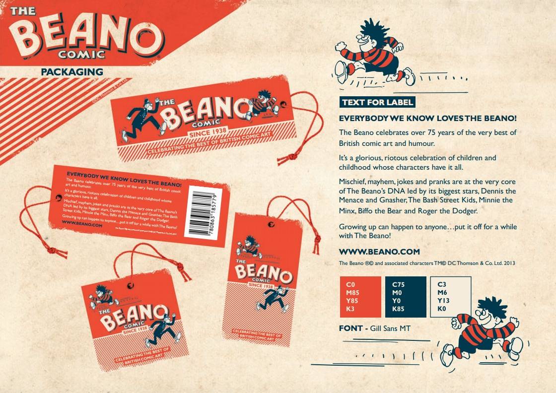
Beano Brand Identity Manual

Beano Brand Identity Manual 7 Beano Brand Identity Manual 6 Beano Brand Identity Manual 5 Beano Brand Identity Manual 4 Beano Brand Identity Manual 3 Beano Brand Identity Manual 2 Beano Brand Identity Manual 1

Now this is what I call a serious flashback to some sweet childhood memories! I was an avid Beano reader and was a member of the Beano fan club with some cool dudey membership items that I can’t properly remember now. I forgot the joy and excitement waiting for the next Beano just drop through the door with my Dad’s newspaper, such excitement.

So it’s simply magical to see these Beano Brand Guidelines, designed by Wayne Hemingway, surface on the web. I have pulled out a few of the pages from the Beano PDF which you can view in full over on Design Week’s Beano post

» Via: Design Week: Beano Brand Guidelines Designed by Wayne Hemingway

Read Beano Brand Guidelines Designed by Wayne Hemingway on imjustcreative - logo & brand identity design portfolio and blog.
Logo Stack: real world logo design inspiration

$
0
0

Logo Stack real world logo design inspiration

If you like the sort of logo design inspiration that has it’s feet firmly in the real world, and not in the make-believe, then I’m hopeful you might like what Logo Stack has to offer.

I started Logo Stack because I was getting a bit jaded with the sheer amount of conceptual, made-up brand name logo designs popping up whilst researching and gathering inspiration for my own logo design projects.

We think we have control over what inspires us, yet we are swayed even when we don’t consciously know it, inspiration is a powerful beast.

When you end up not knowing if a logo was designed to a brief and real world application, or simply more of a portfolio filler—not saying there is anything wrong in make-believe logo designs, simply stating that it’s nice to be able to know exactly how and why a particular logo design came to be—then the boundaries between logos that represent real brands, and those that do not, are blurred to a point where real world logos seem to fade into the background.

The kind of logo inspiration one is ‘consciously’ seeking can be quite different to the inspiration our minds just relentlessly catalogues in our brains, and will often steer our creative direction as it pleases.

Ever designed somegthing you sure was original? Only to find out a few weeks later that you had actually seen something similar, but had not even realised it at the time? Even worse is when someone kindly points that out for you…

At Logo Stack you can be sure that every logo design you see has been used, or is in use by a client in the real world. That every logo you’ll see generally has a purpose and application behind the development and design of said logo.

I think the distinction between real and fantasy is quite important, more so when some logo design galleries are simply choc full of the conceptual.

You may not care if a logo is real or not, that inspiration is inspiration regardless of it’s intended use or destination, but I think it’s a little more important than that in some cases. Hence why I started Logo Stack, so at least there is a place to go should you just want ‘real’.

My Own Personal Taste

The other aspect about Logo Stack is that it’s primarily a collection of logo designs that I personally like, rather than a collection of all and any design.

It sort of started as my own personal inspiration hub, but ended up becoming openly available the more I realised other people were interested in seeing what sort of logo designs tickled my fancy.

Screen Shot 2013-06-06 at 17.13.03

Credits & Attributation

I’m also careful about attributing the proper credits and links to each logo design and it’s designer: be it a solo endeavour or a major agency. Therefore, each Logo Stack post details the project name, and the designer/agency responsible with links back to their home page, and if applicable, the actual project page.

I also add only one style of post Tag: this is the designer/agency name, which means there is a healthy database of names being indexed, and are of course searchable.

Quite a number of logos come from Mr Cup, (what used to be Graphic Exchange), but also come from many other sources. So if I haven’t stumbled across an agency website on my own travels, then I’ll also add a credit to the website I found out about that particular logo.

Just for Clarity

As mentioned above just want to be absolutely bloody clear that I am not dissing the: conceptual, the made-up, the experimentational* (*apparently not a real word) logo design.

What I am trying to do is just create more of an awareness between what we allow ourselves to be influenced by. I have done my fair share of experimenting and still do… it’s an important way to keep ones skills fresh as well as just enjoying the freedom of designing for the hell of it.

But sometimes I just want and need to be influenced by the real, not the unreal.

Other Ways to Follow Logo Stack

Logo Stack on Pinterest

Feed: You can follow the updates to Logo Stack by the websites feed (RSS), and view in your favourite feed reader.

Pinterest: There is a Logo Stack board on Pintertest, so if this is your inspiration hub, then you’ll easilt be able to keep-up-to-date.

Designspiration: Shelby is doing a terrific job over at Designspiration, and I have finally been able to create a Logo Stack section over there as well.

Flickr: I have created a Flickr Logo Stack Set that also will contain all new logo designs published to Logo Stack.

Twitter: Each new post gets Tweeted with a #LogoStack ‘hashtag’

Tumblr: Each Logo Stack post is sent on it’s merry way to my casual tumblr account, but it’s not specific to Logo Stack.

Google+: As Tumblr above each new Logo Stack post is published to my Google+ feed

Read Logo Stack: real world logo design inspiration on imjustcreative - logo & brand identity design portfolio and blog.
Allowing a Client to Choose a Font for Their Logo [AQFG]

$
0
0

I certainly understand that choosing the right font for a logo design can seem to some clients to be a complete mystery that will get them so worked up that they refuse to want anything to do with it. I guess with some clients that might be a good idea, but there are certainly some clients that might be better at selecting a font than they themselves realise.

I’m not necessarily talking about giving a client a ‘blank sheet’ and expect them to do your job for you, neither am I suggesting you SHOULD always give your client a choice, but there is place and time during the course a logo design where a clients input might make the client feel more part of the design process.

I know it might seem obvious to some of you, but I do know some designers who refuse to allow their clients any where near making a font choice because said designer has already got the final design signed-off in their head, even if the client doesn’t know it yet.

So I thought I would just scribble a few words about this important part of the logo design process.

I often find myself asking the client to choose from a selection of fonts that I have carefully and thoughtfully sifted though, often after days of searching and scanning 100′s and 100′s of options. Yet when I present this carefully curated list of font options the client can often remark, “I don’t know what I’m looking at because I know very little about fonts.” This is a honest response, but I also then feel that a client can make the idea of choosing a font to be so hideously difficult that they simply shut-down at the very idea of being asked to make a choice.

Font Choices

It’s important to explain to the client that you would not allow them to make a drastically bad decision, or choose a font that technically or aesthetically is totally inappropriate, but at the same time giving them some confidence to take part in the evolution of their logo.

If you don’t make it clear that you are the font ‘gate’ keeper, then they might reasonable presume they could choose completely the wront font which is where the anxiety usually comes from.

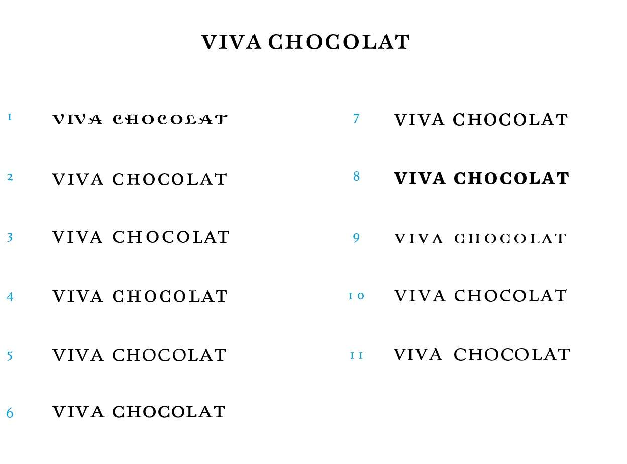
Often at this point in a logo projects evolution, the logo mark has been signed off, the general style of the font has also been approved: say a strong serif font (see above for Viva Chocolat: I used this selection as the final selection for the client to choose from, but I did thrown in a wild card). You’ve found a selection of approximately 12 serif fonts that you feel would work, but now would like the client to see if there is one from this ‘final’ selection that they like. It’s not them choosing life or death here, it’s giving them the opportunity to make a style choice that’s not going to break a logo into a million pieces.

I might say to them that it”s more about looking at a font style as a form of dress or suit: does it fit the body shape well, is it styled in a manor that is pleasing to you, and overall does it look appropriate to represent your brand.

One will know if a suit or dress is inappropriate for a certain event, we even know what’s acceptable for just going down the pub on a Friday. That decision would be much much easier then if you had your partner pick out 6 suits/dresses for you, and asked you to choose one knowing that all 6 would be suitable. All you need to do now is not worry about picking a suit that is going to be a disaster because you trust your partner to know exactly what is appropriate, so you can now breathe a little easier knowing that you can now choose one that best reflects the look you want to give.

The client needs to know that you have carefully selected a range of fonts that any one of would work, but one will, or could be, more preferable to the client even for a reason they might not understand. Simply might just be a gut feeling, or something else as to what font they choose.

Asking a client to choose a font doesn’t need to be a massively anxiety filled decision, or even one that is technically or right or wrong. You can also encourage them to try and give ‘simple’ reasons for any choice they make as they might surprise themselves, and you for that matter, by actually coming up with something that is valid and appropriate.

“Ultimately I wouldn’t let you choose a font that was totally wrong, inappropriate in any way!“*

*Although there are cases where a client will insist of a font choice that is a complete disaster even after your passionate pleas to listen to reason. Sometimes you simply can’t get through and have experienced reason taken seriously.

Graham Smith

Ask Graham a Question on Logo & Brand Identity [AQFG]

If you have a question or issue that you need a hand with then please take a look at this post: http://imjustcreative.com/ask-graham-a-question-on-logo-brand-identity and feel free to whip me a line.

I’ll try my best to address it in a unique blog post so that you and others can hopefully get some use from it.

Read Allowing a Client to Choose a Font for Their Logo [AQFG] on imjustcreative - logo & brand identity design portfolio and blog.
Fender Logo Design Evolution

$
0
0

Fender Stratocaster Logo Design

“Spaghetti” Fender Logo Design

Fender 'Spaghetti' Logo Design

Fender has used several styles of logos, usually referred to as: “Spaghetti”, “Transition”, and “CBS” which were used to adorn the headstocks of their guitars.

As with the Marshall logo, the original ‘spaghetti’ style Fender logo (above) is by [someone unknown], although general chatter suggests it was based on Leo Fender’s own signature with the ‘F’ being simply reversed! It’s a detail like that that can really create a truly ownable brand mark. Not happy with letters the right way round? No problem, just reverse them! :)

The term ‘spaghetti’ wasn’t official, but was penned by Fender enthusiasts and collectors in later decades. This original version of the Fender logo was used in the 1950′s and 1960′s on most of the Fender instruments, including: Esquire®, Broadcaster®, Telecaster®, Stratocaster®, Precision Bass® and Jazzmaster® guitars as well as several other Fender instruments of that period.

“Transition” Fender Logo

Fender 'Transistion' Logo Design

The gold Fender logo (above) with black outline was called the ‘transition logo’, and was designed by adman and graphic designer, Robert Perine.

The main reason for deploying a new logo was that Robert wanted to cut down on all the various Fender trademarks in use, and thus adopt one single Fender logo type.

Perine’s new Fender logo was used up and till CBS took Fender by the reigns which was introduced in 1967. The gold version of the Fender logo was called the ‘transition’ logo simply because it spanned the ’spaghetti’ style Fender logo of the 1950′s, and pre Fender CBS-era of the late 1960′s.

CBS-era Fender Logo

Information on the CBS-era Fender logo is somewhat scarce, but it was a thick black logo that was used between 1968-1980.

CBS Era Fender logo design

You can see the difference in all 3 versions below, the last one being the style used by CBS until the 1980′s when Fender changed back to using the ”transition” and “spaghetti” logos, depending on the model.

Fender logo styles

Current Fender Logo

What’s interesting is that the Fender logo you know see on the website (below), white lettering on red background, is pretty damn close to the first ’spaghetti’ style Fender logo but for a few positional changes, curves and proportions.

Fender Logo Design


Fender website

I have crudely over laid both the original, and new Fender logo (below),  for comparison. The red lettering is the Fender logo currently is use whereas the slightly pixelated black/grey version is the original ’spaghetti’ style Fender logo.

Fender Old and New Comparison Logos


Who designed the current Fender logo?

I can’t find any information on who ‘tweaked’ the newest logo now used by Fender, but I think it’s safe to say that who ever designed the first one takes credit for the Fender logo overall give it’s closeness to the original logo design. Unless you disagree?

Resources

Some official information on the history of the Fender logo over on Fender.com and you can download various Fender brand logos and style guides on their Brand Logo page.


Read Fender Logo Design Evolution on imjustcreative - logo & brand identity design portfolio and blog.


ADXPRS Logo Design Deconstructed

$
0
0

ADXPRS Logo foundation

All these lines, circles and intersecting guides, for my ADXPRS logo design, are very much relevant, and not just trying to look impressive. :-) Maybe I’m a little anal about how I like things to align, match and such, but gives me a sense of having achieved a small part of ‘perfection’.

Construction of a logo needn’t be so rigid, but some logos definitely look better when the smallest of alignments are made to work.

Read ADXPRS Logo Design Deconstructed on imjustcreative - logo & brand identity design portfolio and blog.

SEAT’s Redesigned Logo and it’s New Brand Universe

$
0
0

Seats Logo Design


Seats Logo Design 5

Print

Seats Logo Design 3

Seats Logo Design 2

Seats Logo Design 1

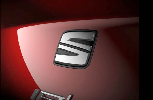
I’ve never particularly been fond of many car brand logos/emblems/badges, something about the way they just sit there, usually in ‘silver’, looking all meh.

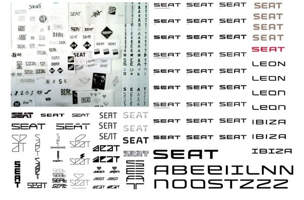
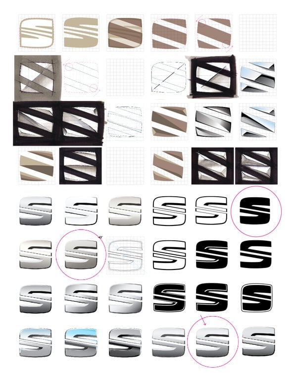
However, seeing the sketches and process behind the redesigned SEAT logo has certainly given me a much healthier appreciation of the work and thought that has gone into this updated logo and brand identity for SEAT.

Not sure about the use of Universe though…

Particularly like this image (below) explaining the ‘Origins of the Diagonal’ within the S logomark.

Seats Logo Design 6

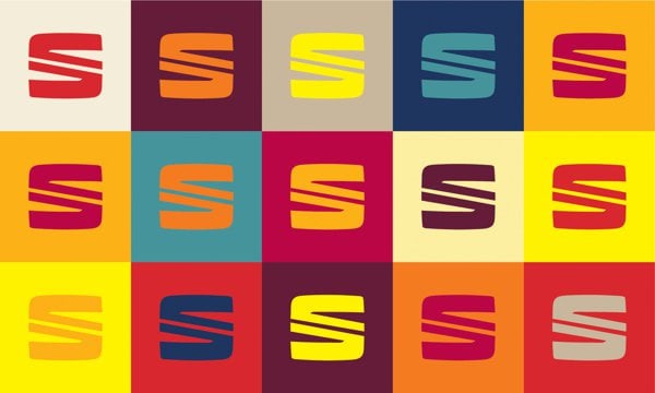
SEAT Press Release: The new logo represents another step in the continuous development of SEAT’s image, aligning corporate identity and design with the brand’s platform, and openly symbolizing the six values of the company- design, dynamism, young spirit, efficiency, reliability and accessibility.

The new visual element comprises the inseparable twosome of passionate red- warm and dynamic- and the unmistakable chrome stamp of SEAT. The evolution of the logo symbolizes the transformation of the company itself, a balance between its rational component and the most emotional part of the Spanish brand. Characterized by its symmetrical lines in permanent tension, the chrome symbol is sculpted with precision and is firmly rooted in modernity, all of which lies below a subtle line of industrial inspiration. Its unique design highlights the renewed commitment of SEAT to precision technology, excellence in engineering and innovation, while the colour red continues to evoke the brand’s Spanish soul.

The origins of the elegance and precision of the SEAT logo are to be found in a diagonal stroke reminiscent of Barcelona’s Avenida Diagonal. This line consolidates a creative vision, and is an essential component of SEAT’s genetic code. Vibrant touches of Spanish design give it life- warm highlights, deep shadows, dynamic perspectives and joyfulness link people to a new hybrid lifestyle (rational and emotional).

In terms of identity and corporate design, the logo is one of the visual elements forming part of the company’s new vision. Although the brand’s main activity is car-making, design takes on special importance amongst the company’s values, and forms an intrinsic part of its genetic code. Design is SEAT’s DNA. To quote Alejandro Mesonero-Romanos, SEAT’s head of Design, SEAT’s new logo design reflects perfectly our love for detail and quality. While keeping the identity of our traditional “S”, this time we have reduced the number of lines, they are now more 3D and the overall perimeter is now more square, more geometric. The whole gives our new logo a more modern, precise and sculpted look.

Along these same lines, the SEAT logo has been a joint effort in design, development and implementation between the SEAT Design Center (SDC) and the company’s department of Marketing-Communication, from the initial research and sketches to the 2D version of the new symbol. Additionally, the exterior design of the New Leon has had an impact on the creative development of the logo, particularly on the conceptualization of the flowing liquid-like surface, projecting quality and precision. The creative process began half-away through 2010 and has had a progressively executed timeline.

» Source: http://logonews.fr/seat-devoile-son-univers-de-marque/
» Via: @TomA_Dix9 BrandingSource & BrandNew

Read SEAT’s Redesigned Logo and it’s New Brand Universe on imjustcreative - logo & brand identity design portfolio and blog.
Interbrands Top 50 Global Green Brands of 2013

$
0
0

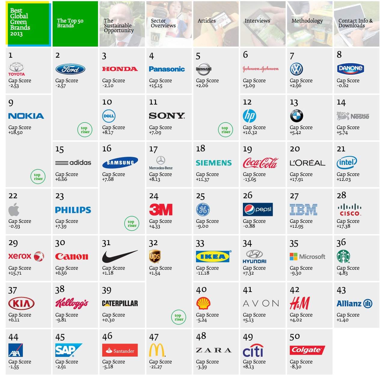
Interbrands Top 50 Global Green Brands of 2013

This is really interesting viewing/reading if you are interested in what brands/companies are doing their bit for our environment. Interbrand have created this dynamic Top 50 list that allows you to see information relative to each brand, and their commitment to adopting ‘greener’ technologies and work practices.

Specifically, it’s about sustainability: defined as an ongoing effort to improves the quaity of human life while living within the limits of supporting ecosystems.

For Interbrands top Top 50 Global Green Brands of 2013, sustainability is defined as: “…business approach to creating long-term value by embracing opportunities and managing risks derived from economic, environmental, and social impacts. In a commercial sense, sustainability also involves creating and maintaining a product, service, or business identity that reflects special added value in terms of environmental and social benefits. Sustainability has proven to be a strategic and profitable aspect of business and a brand-strengthening asset, as long as organizations take measurable steps to reduce their social and environmental impact and credibly convey benefits that are relevant to consumers.”

It’s definitely worth checking the first row of boxes as these provide essential information that allows you to put the results all into context.

» Source: Interbrand

Read Interbrands Top 50 Global Green Brands of 2013 on imjustcreative - logo & brand identity design portfolio and blog.

Carhartt Logotype WIP Process by Sergey Shapiron

$
0
0

Carhartt-WIP process by Sergey Shapiro 1

Carhartt Logotype WIP Process by Sergey Shapiron

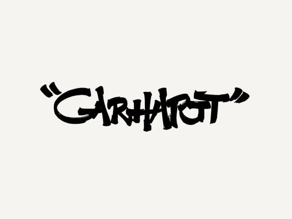
Really enjoy studying these marvellous hand-drawn lettered sketches for Carhartt, by Sergey Shapiron. These have not been designed to replace the main Carhartt brand logo, but for an upcoming 2014 collection.

Sergey Shapiron: “Some of hand drawn/written sketches I did while working on a new t-shirt design for Carhartt-WIP 2014 collection. All sketches are scanned without any further tweaks done.”

Quite a variation in lettering styles with some being far less readable than others, but as it’s all exploratory work one has to take design to the limits in order to fully assess your ‘window of opportunity’, so-to-speak.

I have only selected a few of the Carhartt sketches, but there are loads more over on Sergey’s Behance profile.

Carhartt-WIP process by Sergey Shapiro 3 Carhartt-WIP process by Sergey Shapiro 4 Carhartt-WIP process by Sergey Shapiro 5 Carhartt-WIP process by Sergey Shapiro 6 Carhartt-WIP process by Sergey Shapiro 7

Carhartt-WIP process by Sergey Shapiro 9 Carhartt-WIP process by Sergey Shapiro 10 Carhartt-WIP process by Sergey Shapiro 11 Carhartt-WIP process by Sergey Shapiro 12 Carhartt-WIP process by Sergey Shapiro 13 Carhartt-WIP process by Sergey Shapiro 14

Carhartt Logotype WIP Process by Sergey Shapiron


Read Carhartt Logotype WIP Process by Sergey Shapiron on The Logo Smith - forging logomarks of distinction since '86.

Sketching Whilst on a Frustratingly Tiresome Hold with BT Helpline

$
0
0

Logo Sketches

After having my BT Broadband upgrade to BT Infinity brilliantly ballsed up by a BT contractor, leaving me with no broadband at all, I ended up having to making a number of horrifyingly frustrating calls to BT’s abysmal call service hotlines.

The calls to BT started at 6pm Monday evening, and after 4 separate calls, and talking to 6 different people in various parts of the world, I gave up the will to live at 11pm being no better off in getting my broadband up and working.

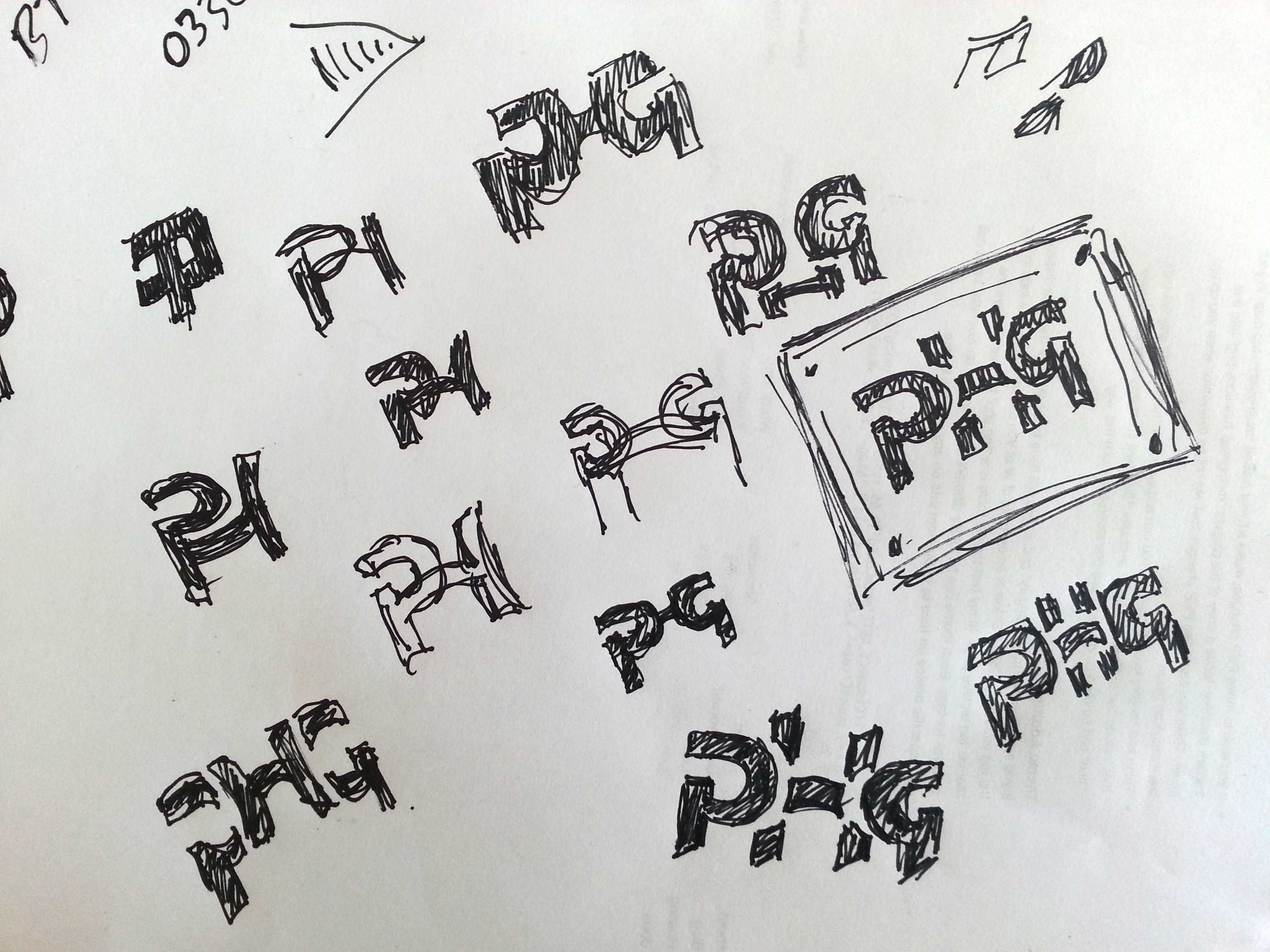
However, all this time on hold and listening to scripted questions, I ended up sketching some ideas for a logo project I’m currently working on. The one with the frame has a nice symmetry as the P and G are/would be the exact same form, just flipped vertically, with the H sitting behind, but gelling all 3 initials: PHG, together. It’s a little more interesting that just having 3 regular initials, and basically does become a logomark in it’s own way. It could be used independently of the full length typemark; Pleasant Hill Grain, for example, rather than being a regular logomark that typically always forms part of the whole logo.

I think twiddling my thumbs would have left me close to wanting to commit a terrible act upon myself to avoid the ongoing misery, but the doodling actually proved to be very soothing and actually actually lead to a decent idea to pursue further. Hadn’t previously seen that the P & G could be formed from the same shape thus creating a reasonable solid, and quite unique initialmark

Not sure what the moral is of this tale, but maybe always have a pen and some paper handy should you ever find yourself stuck in an infinite loop of BT helpline hell.


Read Sketching Whilst on a Frustratingly Tiresome Hold with BT Helpline on The Logo Smith - forging logomarks of distinction since '86.

Viewing all 238 articles
Browse latest View live